Custom Dashboards & Threshold Alerts
The Custom Dashboard lets you build personalized dashboards with custom charts to track specific metrics across one or more sites and projects. You can create Time Series, Histogram, and Correlation charts to compare and monitor performance data, and configure alerts to receive notifications via email or webhooks.
Create a Custom Dashboard
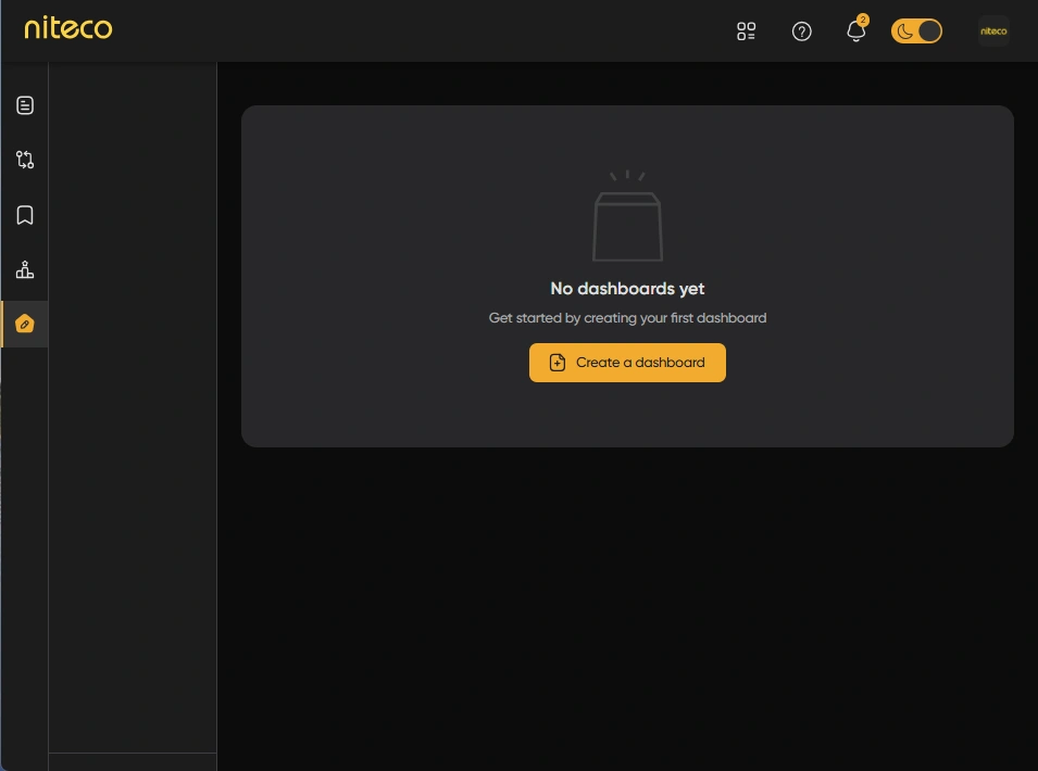
Navigate to the Custom Dashboard by clicking on the Custom Dashboard Icon in the left menu
Click on Create a Dashboard to open the custom dashboard form
Dashboard form to fill data
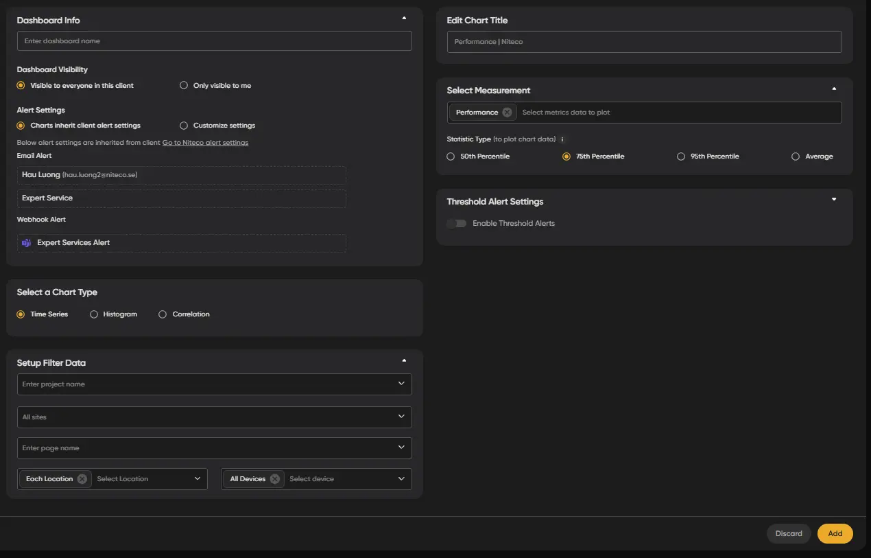
Configure Your Dashboard
To add a chart to your dashboard, follow these steps:
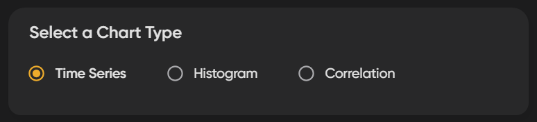
1. Select a Chart Type
Select the chart type by choosing from one of the three options:
- Time Series: A Time Series Chart is a graphical representation that displays data points in chronological order, allowing users to observe trends, patterns, and changes over time.
- Histogram: A histogram is a graphical representation of the distribution of numerical data, displaying the frequency of data points within specified ranges or bins, which helps visualize the shape and spread of the data.
- Correlation: A visual representation that displays the relationship between two or more variables, often using scatter plots or matrices, to illustrate how changes in one variable correspond to changes in another, helping to identify patterns and strengths of associations.
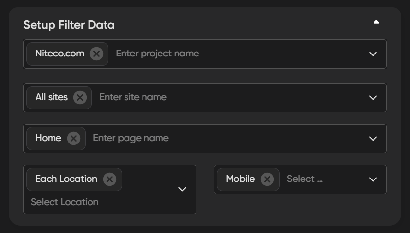
2. Setup Filter Data
Choose the data sources for your custom dashboard:
- Projects: Choose the project that you would like to take the metrics from for the graph.
- Sites: Choose the sites that you would like to take the metrics from for your graph.
- Pages: Choose the pages that you would like to take the metrics from for your graph.
- Locations: Choose the test locations you would like to take the metrics from for your graph.
- Devices: Choose the test devices you would like take the metrics from for your graph.
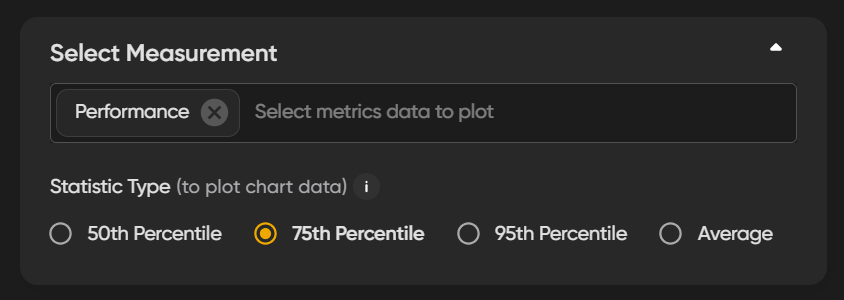
3. Select Measurement
Add the specific metrics from tests that you would like to visualize and plot on the chart. You can choose to track any of the metrics which are included in reports such as performance, seo, accessibility or specific metrics such as Largest Contentful Paint (LCP) or Page Load time for example.
Statistical Type
Choose a percentile for your graph:
- 50th Percentile (Median): This shows the typical user experience, indicating that half of the page load times fall below this value. It's helpful for understanding the average performance users encounter.
- 75th Percentile: This represents the upper range of performance, meaning 75% of page load times are faster than this value. It highlights how well your site performs for most users, especially in busier conditions.
- 90th Percentile: This focuses on the top 10% of load times, showing how the site performs under peak stress. It’s crucial for identifying potential issues that might affect users experiencing slower loads.
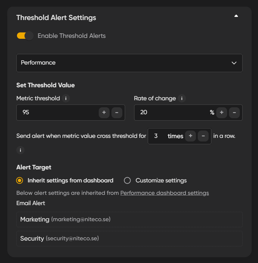
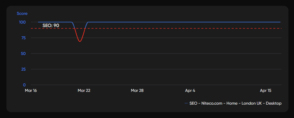
4. Setup Threshold Alert Settings
Performance thresholds let you define limits for triggering alerts within the system. There are two types of alerts: absolute thresholds and relative thresholds, and they work together to determine when alerts should be triggered.
- Absolute Threshold: Defines the specific value a performance metric should not exceed or fall below.
- Relative Threshold (Rate of Change): Monitors significant deviations in a metric's value relative to the Absolute threshold you set.
For example, if the absolute threshold for a site's performance score is set at 90, and the relative threshold is set to a variance of 5, any metric value falling below a score of 85 or above a score of 95 will trigger an alert and indicates a performance change.
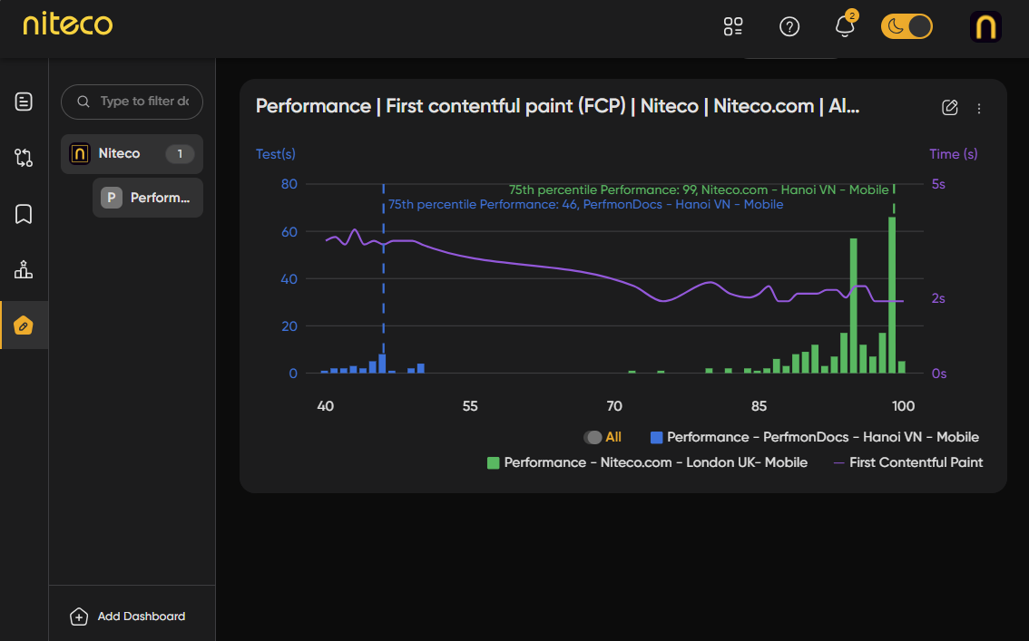
Once you have entered your preferences for the chart you will see a preview of the chart above the form. The chart tracks performance metrics over time, so if you just setup your first tests there may not be much data to view yet. If you are running your tests daily, you should see more data after several days. Click on Add to create your new chart.
You will now see your chart in the Custom Dashboard and can return to it at any point to monitor the metrics it is setup to track. You can also edit your chart at a later date.